
The Client
Elle Nine, LLC, Art Shop Brand
The Service
Brand Design + Web Design
The Overview
Elle Nine is an art shop where I create and sell original artwork along with high quality art prints and lifestyle pieces. The brand is centered around offering one of a kind creations that feel personal, intentional, and expressive.
The goal of this project was to build both a brand and website that allows the artwork to be the main focus. I wanted the entire experience to feel like a blank canvas where the art itself becomes the decoration.
The Vision
The direction for Elle Nine was rooted in simplicity, intention, and expression. I did not want a busy or overly designed brand. Everything needed to feel calm, inviting, and slightly elevated while still allowing the artwork to speak for itself.
The brand needed to reflect both sides of me as an artist. My feminine and fluid nature along with my structured and intentional approach to creating. This balance shows up not only in the artwork but in the overall identity of the brand.
The Design Approach
I started with the branding by building a soft, earthy color palette centered around muted shades of green. These tones were chosen not only because they align with my personal style but also because green represents nature, emotion, healing, and renewal which are all reflected in my work.
For the logo, I used a calligraphy style font for “elle nine” in all lowercase to create a soft and natural flow. This choice reflects my comfort in stepping outside of traditional structure and embracing a more relaxed and expressive identity.
To balance that, I added “xiix” beneath the logo in a clean sans serif font. This represents my birth date in roman numerals and introduces a structured element to contrast the fluidity of the script. Subtle color variations within the lettering create visual interest while still keeping the design minimal.
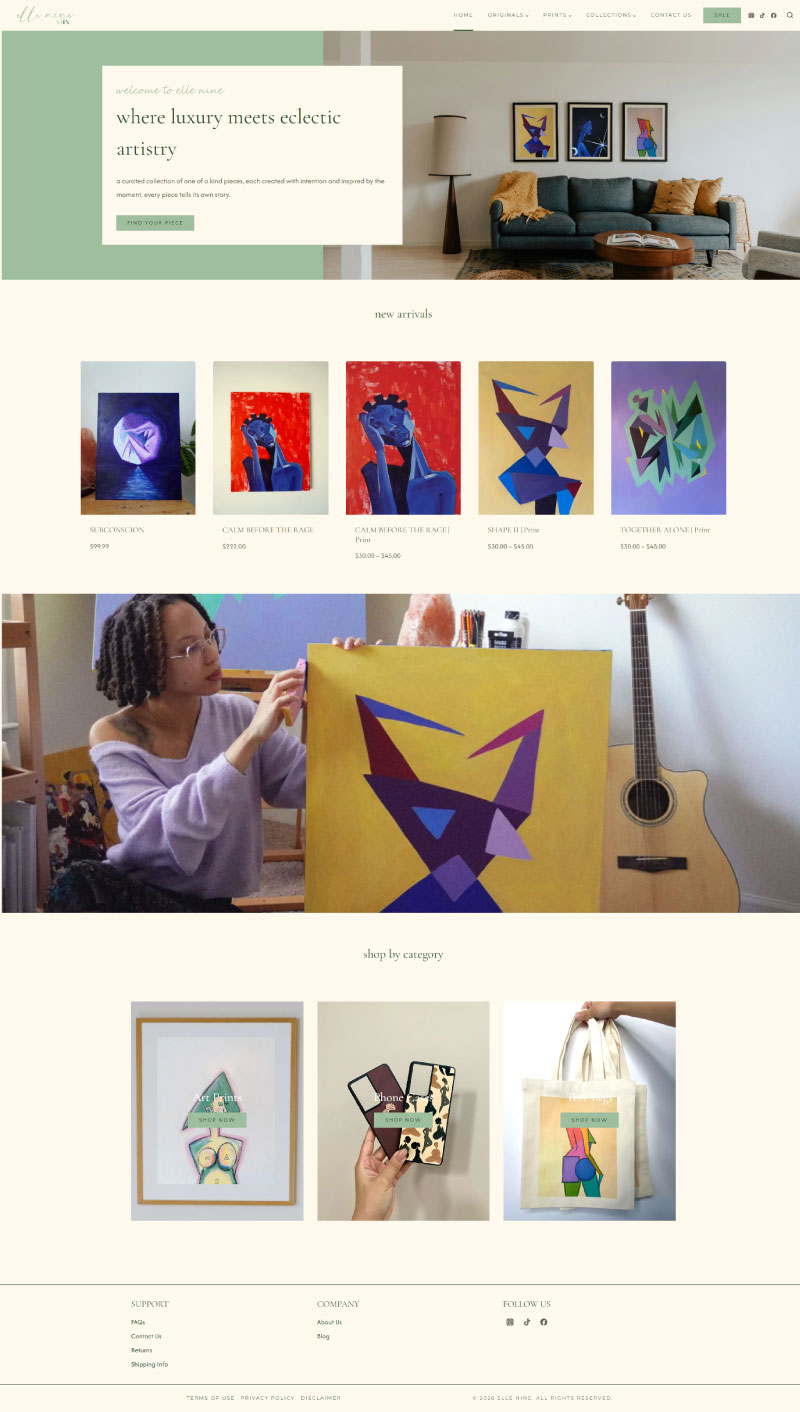
For the website, I carried that same philosophy of simplicity throughout the entire experience. I built the site using WordPress and WooCommerce with the Kadence theme as a base, keeping the layout clean and easy to navigate.
The background uses a soft off white tone to create warmth without competing with the artwork. The homepage opens with a hero section displaying my art in a real home setting along with a simple introduction and a call to action that leads directly into shopping.
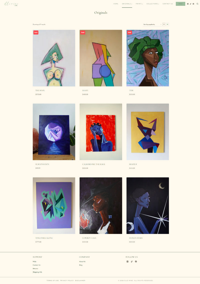
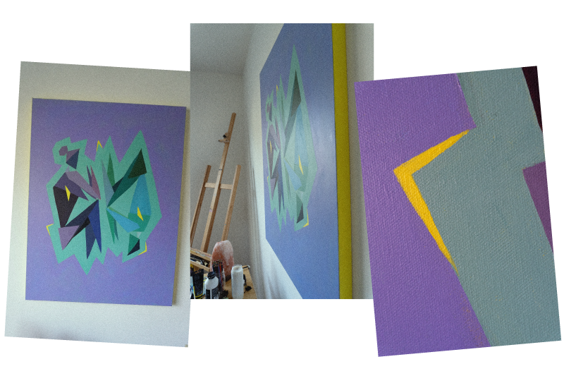
From there, the layout flows into a “new arrivals” section to highlight recent work, followed by a visual section showing snapshots of my creative process. I then included a “shop by category” section to guide users through different product types like art prints, phone cases, and tote bags.
Typography was kept mostly lowercase to maintain a relaxed and approachable tone, while the titles of each art piece are in all caps to give them emphasis and presence.
The Results
The final brand and website feel cohesive, intentional, and true to who I am as an artist. The simplicity of the design allows the artwork to stand out while still creating a full experience for the viewer.
The site is easy to navigate, visually calm, and structured in a way that guides users naturally through the shop. It creates a balance between expression and clarity, allowing customers to connect with the work while also making the shopping experience seamless.
This project is a reflection of how thoughtful design can support the art without overpowering it, creating space for both the brand and the work to exist in harmony.
Explore Recent Projects
Let’s Bring Your Vision To Life
Book a consultation and let’s create a website that works as beautifully as it looks.